Tag: support

  • Support and resistance – Understanding Critical Rules

    Support and resistance – Understanding Critical Rules

    Support and resistance - Understanding Critical Rules 7You can recognize support and resistance as horizontal trendlines which cause a stock’s direction to reverse.
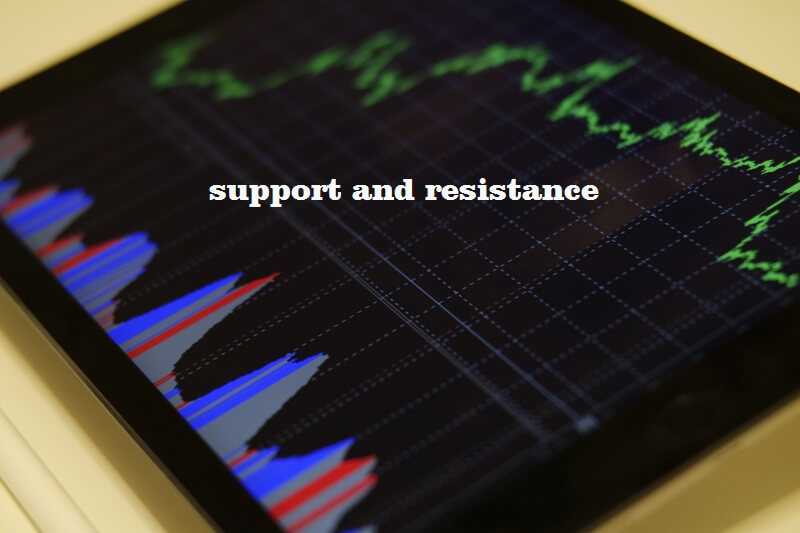
    By Guy Avtalyon

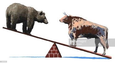
    Support and resistance are two of the essential technical patterns. Also, they are very effective.

    When the price is falling, support signifies the moment when buying overwhelms selling and prices reverse. Opposite, when stocks are moving upward, resistance is the point where selling is much bigger than buying, and the price rises stop.

    In other words, support and resistance levels are important points in time where the forces of supply and demand meet.

    The support and resistance levels are essential when technical analysts have to discover market sentiment and supply and demand.

    Let’s take a look basic first.

    Take a look at any trading chart. You’ll notice a zigzag form that is making its way up. So you can normally conclude it is a bull market. Every time when the market moves up and then pulls back, the highest point reached before it pulled back is now resistance. Remember this!

    As the market remains up again, the lowest point reached before it started back is one that traders support now. So you can see, resistance and support are constantly created as the market changes over time.

    When the support or resistance levels are broken, the supply and demand relationships that form these levels will change. If that happens, new levels of support and resistance will probably be established.

    Support

    Support is the level at which demand is powerful enough to keep the stock from falling any further. In the image above you can see that each time the price reaches the support level, it has difficulty penetrating that level. The rationale is that as the price drops and approaches support, buyers (demand) become more inclined to buy and sellers (supply) become less willing to sell.

    Support is the price level at which demand is considered to be powerful enough to stop the price from decreasing further. As the price declines towards support and gets cheaper, buyers become more willing to buy. Hence, the sellers become less willing to sell. By the time the price reaches the support level, it is believed that demand will overcome supply and prevent the price from falling below support.

    Resistance

    Resistance is the level at which supply is powerful enough to prevent the stock from going higher. Each time the price reaches the resistance level, it has hard to move higher. The rationale is that as the price rises and approaches resistance, sellers (supply) become more inclined to sell and buyers (demand) become less willing to buy.

    Resistance is the price level at which selling is considered to be strong enough to stop the price to rise further. As the price advances towards resistance, sellers become more willing to sell, but buyers become less willing to buy. When the price hits the resistance level, it is signal that supply will overcome demand and stop the price to rise above resistance.

    Precisely recognizing these trend changes allows you to establish initial price targets and to develop your own sell discipline. Understanding the details of support and resistance levels will improve your chances of success.

    Support and resistance understand the critical rules 

    Trends challenges

    Support and resistance usually work as crucial trend changes. When a current trendline reaches resistance, you should be ready for a vital shift.

    If support displays the flags of the violation, that same level will become a future resistance. As the chart illustrates, the same horizontal trendline continues after support is violated, but with differing effect.

    Retests reinforce

    Also, when retests reinforce, you have to follow one rule. The more often you test a trendline, the more valid it becomes. For example, if the chart shows solid resistance at some price and, let’s say during the three or four months you notice separate challenges of this level, you should expect future rallies to halt at this price.

    Volume reinforces

    If a resistance or support level is in association with the increasing volume, the trend becomes more valid. Consider the trading history in the chart.
    Do you see the dates?
    Every time when the price level is tested, the volume increases. When pattern adds weight to some level it indicates that overcoming that price point will take significant time.

    Timepoints

    The new set level is more useful. A difficulty with this bear market is that many traders recognize quick losses from the past while they were looking for support levels. Unfortunately, following a distant history, isn’t helpful.

    This is a real-life example, by examining a three-year graph of Google (GOOG), we see solid support at $520. The support level hadn’t be tested for more than a year, and what happened? Stocks dropped in the fall of 2008.
    This made support less important.
    When GOOG quickly traded through $520 and continued dropping, traders were surprised and had losses.

    The importance of support and resistance

    The technical analysis serves to determine the future price of a security or market. Some investors will use both, fundamental analysis and technical analysis. Hence, they’ll use fundamental analysis to decide what stock to buy and technical analysis to decide when to buy.

    Don’t forget that technical analysis is not an exact science and it is subject to interpretation. As with any discipline, it takes work and dedication to become adept at it.

    Support and resistance are primary and essential technical analysis tools. On every time frame, intra-day, daily, weekly, and monthly, support and resistance levels are focused on by traders. Knowledge of these levels could hold a trader on the right side of the market.

  • How To Read A Stock Charts With Examples?

    How To Read A Stock Charts With Examples?

    How To Read A Stock Charts? 7
    Amateur traders act upon impulses and this is a problem because all is not as it seems in the market.

    By Guy Avtalyon

    Stock charts are extremely important. When you enter the stock market, which means that you bought your first stock, you will find that you have to follow the movement on the stock market through stock charts.

    First of all, you have to register that fund managers and big investors account for 80% of all trading activity in the market. Their buying and selling will either push your stock up or down. But you are the individual investor and your primary intent is to buy stocks big investors are buying ponderously and of course, you want to stay away from stocks they’re aggressively selling. That’s where charts enter. Once you know what to look for, you’ll see that charts literally show you what these big investors are doing. You’ll be able to fast realize when a stock is being ponderously bought or sold. You’ll be able to use that information to identify the best time to buy, sell, or hold your stock positions.

    There are many different types of stock charts: line, bar, candlestick, mountain, point-and-figure, and others. You can see them in different time frames: daily, weekly, monthly, and intraday charts. Even each style and time frame has its advantages and disadvantages, all of them provide you information important to make investing decisions.

    Also, there are many different types of stock charts that display various types of information. But all stock charts display price and volume. On each stock chart, the price history is visible. The bars represent the amount of trading history.
    For example, on a daily stock chart, each price bar shows the prices the stock traded during that day. On a weekly stock chart, each price bar represents the prices the stock traded over that week.

    The length of each vertical bar shows a stock’s high/low price range. The top of the bar shows the highest price that is paid for the stock per period and the bottom of the bar shows the lowest price paid. The small horizontal slash shows the current price or where a stock closed at the end of the observed period. The price bar is blue if the price of the most recent trade is equal to or greater than the previous period last price, or deep red if it is lower than the previous period’s price close.

    The vertical lines at the bottom of the chart show the number of shares traded during the observed period of the chart. The length of the volume bar shows a value that corresponds to the scale at its right. The color of a volume bar is determined by its corresponding price bar. It’s blue if the most recent trade is equal to or greater than the previous period’s last trade. And magenta if it is less than the previous closing price.
    Well, you are beginners so it is important to show you step by step how to read charts.

    You can use different websites but I think that Google Finance has a smooth user interface.

    How typical stock chart look?

    Now let’s take a look at a typical stock chart. We used Dow Jones Industrial for this guide.

    You can see, the series of letters after the name of the company is the ticker symbol. It identifies the company on the stock exchange.

    We’ll search for AAPL, which is Apple’s ticker symbol.  

    How To Read A Stock Charts? 6

    Then, click the button to expand the chart to full screen:

    How To Read A Stock Charts?
    Now let’s jump into the different pieces and parts of the stock chart so you can begin to read like a pro.

    How to identify the trend lines?

    This is that blue line you see every time you hear about a stock! It’s either going up or down right? The trend line seems like common sense, but there are a few things I want to show so you can understand it in a little more detail.

    You know that stocks will take huge dives and also make huge climbs. If you’ve read previous chapters you’ll know that you have to hold your emotions in control to be a successful investor.

    Never react to large drops or huge gains in a positive or negative way. You are using this piece of the stock chart only to see what’s going on.

    The trend line should motivate you to dig further. For instance, Apple as a company really took off from 2009 to 2012. But in the period 2012/2013, the stock began to go down more than 40%!  This is where your trend line is useful.

    Something is happening and you have to pay attention to it. You have to find out what’s going on with this company. Most strong companies can recover from hits like this, but you have to be careful.

    I have to recall some history here. Right around this time, Apple experienced a few major changes. First, it’s longtime CEO, Steve Jobs, resigned (2011). Also, around 2012, Apple informed that their profit margins were significantly decreasing, despite the growing smartphone market. They were trying to expand the smartphone into developing countries, but they were too expensive to enter there. And the stock price is falling.

    But new CEO Tim Cook made strategic moves with the company and the rest of the trend line shows that.

    How to use trend lines?

    The lesson here is how to use your trend line as a first peek, an indicator of something worth to look int

    The next thing you have to look at is the lines of resistance and support.

    These are levels at which the stock stays within, over a certain period of time. A level of support is a price that a stock is unlikely to drop below, while a level of resistance is one that it’s unlikely to go above. It will stay the same until some major change occurs, such as a reduced profit margin.

    A stock’s price does the same thing within these lines of support and resistance.

    The point here is to know when to buy and when to sell.

    Take a look at Apple’s stock chart again:

    I want to show you how the process is important. You have to know that everyone will draw lines of resistance and support differently, depending on how long they plan to hold the stock. Short-term investors can draw more to analyze trends during a shorter period.

    So, what we can see in this image?

    How to recognize the support and resistance levels? 

    Line A represents the very first line of support shown. Based on trends earlier to this, everyone feels comfy that the stock price won’t go below this point and probably consider buying at this price or higher.

    Line B is the first line of resistance. It is obvious that the stock has peaked at that point for now and it is expected to go higher. Maybe it’s time to consider selling at this price or slightly lower.

    Line C shows, the stock has bottomed out again, thus creating a new line of support.

    Line D shows the stock price has increased significantly and it’s comfortable to establish this as a new line of resistance.

    The trend continues with Lines E, F, G, and H, bringing new lines of support and resistance as time goes on. If it seems complicated, don’t worry. because it is. And a lot of these are speculations.

    The lines of resistance can help you to decide when to buy or sell. But remember, it’s subjective and it won’t give you a clear opinion of what to do. You have to use some of your own analysis and evaluation.

    How to notice in the stock charts if the company pays dividends?

    On the next chart, you can see if and when the company issued a dividend, as well as if there was ever a stock split:

    How To Read A Stock Charts? 4

    A dividend is when the board of directors decides to give a portion of its earnings back to its shareholders. If you own their stock, you get a small piece of the profit.

    Some companies issue dividends, some don’t. If a company doesn’t issue a dividend doesn’t mean it’s not worth investing in.

    Some companies just prefer to focus on growth, so they’ll reinvest their earnings as opposed to giving it back to the shareholders. Apple, in this case, could pay dividends quarterly without influence on growth.

    Also, you can see that there was a stock split in 2014. That is a strategic move made by the company’s board of directors to issue more shares of stock to the public.

    In this case, Apple did a seven to one stock split, noted as 7:1, which means that for every share of AAPL shareholders owned prior to the split, they now have seven.

    The value of the company doesn’t change, but the share price might. Companies will often do this to attract smaller investors when the share price decreases.

    Many times when a stock split happens, more people invest because the share price is often lower. That increases demand and the overall share price.

    How to find the trading volume in the stock charts?

    On the bottom of the chart, you can see many small, vertical lines. This is a trend of the volumes at which the stock is traded. Volumes shouldn’t be the only determining factor when buying a stock. Usually, trading volumes increase when the company is in public focus, in a positive or negative sense.

    When volumes are increasing, it can also shift the price of the stock quickly. Take a look.

    How To Read A Stock Charts? 5

    Line A, shows a high volume of trading activity that corresponded with a drop in the stock price. Maybe some bad news that day caused people to panic.

    Line B, you can see a slight uptick in trading volume that corresponds with an upward trend in the stock price.

    You shouldn’t necessarily have to assume it there will be a connection between stock price and trading volume. But it’s good to know what the volumes have been in the past and what they are currently.

    If the volumes are high, a lot of people are trading the stock that day and it is a good idea to buy or sell it quickly.

    This is the basics of how to read the stock charts. Once you’ve mastered most of these techniques, you should be able to analyze a stock’s historical activity with high success.Â