Tag: golden cross

  • Golden Cross is extremely powerful pattern

    2 min read

    (Updated Oct. 21)

    Golden cross explained

    by Gorica Gligorijevic

    A golden cross is a technical indicator appears when a faster-moving average crosses a slower moving average. That is the simpler explanation. More important are the moving averages which create the cross.

    To find this pattern you have to observe the 50-day and 200-day. Only these two periods are valid in forming this pattern. When you notice a golden cross happen you will something like this


    Golden Cross is extremely powerful pattern


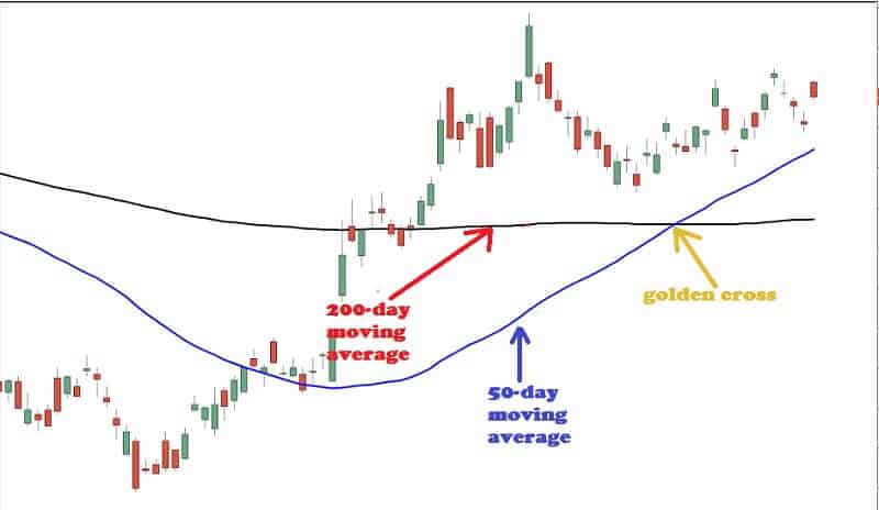
    This pattern is an extremely powerful sign of a strong bull market. It is an uptrend and traders like when seeing this on the daily charts.

    On the chart above you can see the point where the lines of 50-day and 200-day periods touch each other and make a cross.

    Traders always see the golden cross as a Sangraal pattern. Their opinion is that the golden cross pattern is one of the final signs of a bull market. That is a definite buy signal.

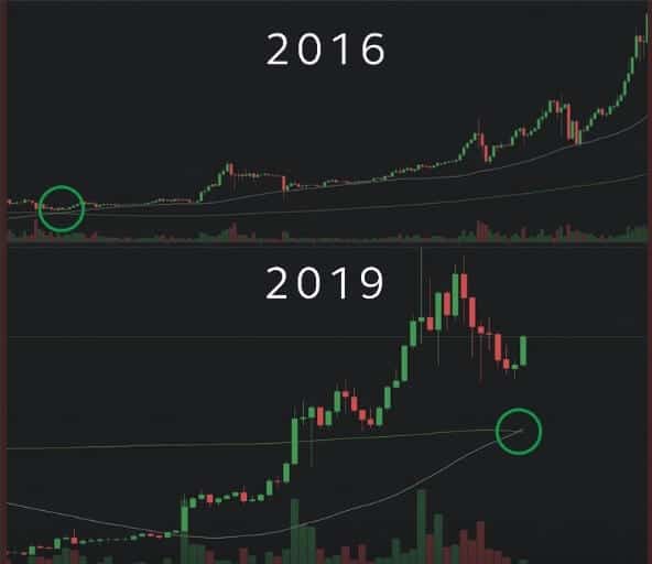
    Traders-Paradise wrote about Bitcoin golden cross. But it occurs in stock trading too. For example, last time when this pattern was seen in the S&P 500 Index, the index has risen by more than 50%.

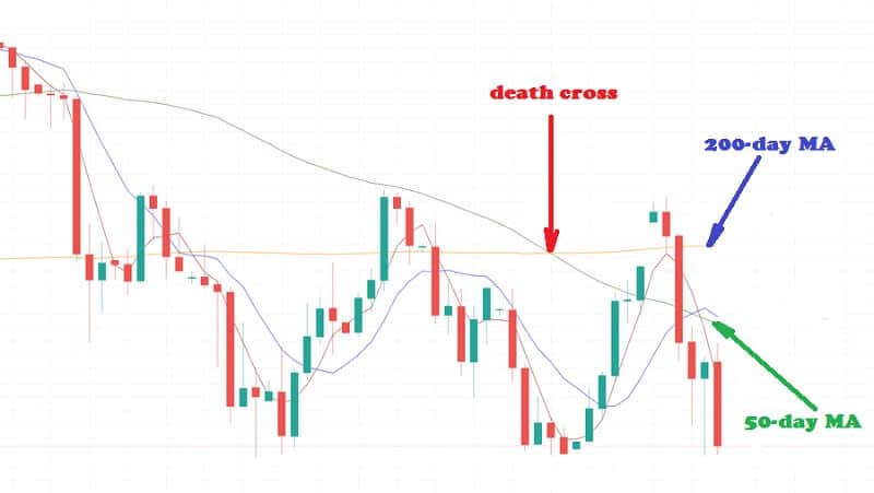
    The opposite indicator is the death cross. The death cross happens when a  50-day moving average crosses from above to under its 200-day moving average. The death cross shows a bear market going ahead. When death cross appears you will see this pattern on your charts.


    Death cross


    But our topic is a golden cross.

    This cross pattern has three explicit stages. The first stage is the point where a downtrend is but you can see it is on its last legs. Why is that? The selling interest is defeated by a stronger buying interest. More traders are willing to buy.

    The second stage includes the development of a new uptrend. The breakout of that uptrend is noted when the short-term MA crosses from below to above the long-term MA. And you can see the point of the golden cross.

    The third stage is when the new uptrend is extended, and more gains verify a bull market. During the third stage, the golden cross’ two MA acts as support levels when occurring corrective downside retracements. The bull market is intact while the price and 50-day MA stay above the 200-day MA.

    How to use the pattern

    The golden cross is useful to discover the right time to enter or exit the market. This indicator is a good tool that can help you to know when it is reasonable to sell and when it is better to buy and hold.

    When you are looking to buy an asset, it can happen to enter the market when the asset’s price increases above the 200-day moving average. Sometimes it is better than waiting for the 50-day MA to secure the crossover. How this can be better, you may ask?

    The pattern is usually a lagging indicator. What does it mean? This means it may not happen until the market has already changed from bearish to bullish. It may be used as a sign that the bear market is finished. So, it is time to exit your positions.

    The golden cross is used to trading individual assets as well as market indexes, for example, the Dow Jones Industrial Average. Also, you can use different MAs to notice a golden cross. For instance, you may use the 100-day MA instead of the 200-day. This pattern can also be viewed for an hourly chart, for example.

    The bottom line

    Some traders and market analysts don’t think the golden cross, also the death cross, are strong trading signals. The cross pattern is usually a very lagging sign, as we mentioned. The Cross pattern has short predictive importance but it is more relevant as proof of an uptrend.

  • Bitcoin’s 3-day chart shows “golden cross”

    Bitcoin’s 3-day chart shows “golden cross”

    2 min read

    Bitcoin's 3-day chart shows "golden cross"

    The last, 2018 was a bear market for Bitcoin and crypto-assets. But this year is a bull market or we can say it is the opening stages of it. Why we are saying that? 

    On the three-day chart, we can see a “golden cross”.

    A golden cross is an exactly a bullish signal. Typically it is a sign that the asset is going to start a bull run. And you can see that on the three-day chart, it is very obvious, without any dilemma.

    The golden cross is a bullish breakout pattern. It is a positive momentum indicator, happening when a security’s short-term price moving average moves above its long-term moving average. 

    Bitcoin price has triggered a “golden cross” on the three-day price chart. That causes great enthusiasm among its supporters.


    golden cross


    The golden cross is a powerful sign that Bitcoin is surely entering a bull run. This conclusion is based on past experiences, of course. So, we can understand why investors are so excited.

    The death cross is the opposite. It is the point where the short-term price moving average moves below the long-term moving average. No matter if we are talking about golden cross or death cross, the short-term moving average is regularly a 50-day moving average. The long-term moving average is a 200-day moving average.

    The similar situation we had in February 2016. At that time, Bitcoin produced a 4,900% return to investors.

    Will the same happen once again? If the golden cross stands, Bitcoin could go on to produce investors enormous returns. The majority of asset class will never bring such return.


     "golden cross"


    A golden cross is a powerful indicator that an asset’s price is going to grow. Opposite, a death cross is an indication that an asset will decline in price.

    ROI (Return on Investment) of Bitcoin was 7,870.79% on the date of 3/8/2019. At the same date, the market cap was $192,025,701,130. The 24h value was $17,827,812,399.

    Before the previous golden cross in February 2016, the Bitcoin was priced at just about $400 per BTC. But after the golden cross was formed Bitcoin brought 4,900% in returns as it hit $20,000.

    When the golden cross appears, the asset will need approximately a year and a half for that, so it might happen in December 2020. Yes, it will take some time for BTC to achieve highs above $500,000 with rising in percentage as this one is.

    Mike Novogratz states that even ordinary investors have to invest 2-3 percent of portfolios into crypto. But, he cautions that they should get “real nervous” if they see the bitcoin price drops below a key level.

    This investor had foretold that bitcoin would consolidate in a range set by $10,000-lows and $14,000-highs.

    The bottom line

    You might think that the market cap of BTC must be very massive to reach this price. Also, it is pretty impossible to see that huge return again soon. But Bitcoin knows how to surprise us. So, everything is possible.

    The moving average on the three-day BTC/USD chart is on a constant upward trajectory. This trend may stay in the future.

    Seasoned traders call this long-term bull market signal a lagging trend indicator. The moving average studies are based on historical analysis. But, we have a low capacity to predict how this asset will behave in the future since the golden cross was seen only once. All we know is that this indicator is a very powerful indicator of bulls trends.

    If history repeats, this sign will confirm that soon we will see a true record rally. The one that will go far over the previous maximum.

Traders-Paradise