Tag: charting

  • How To Read Stock Charts?

    How To Read Stock Charts?

    How To Read Stock Charts?
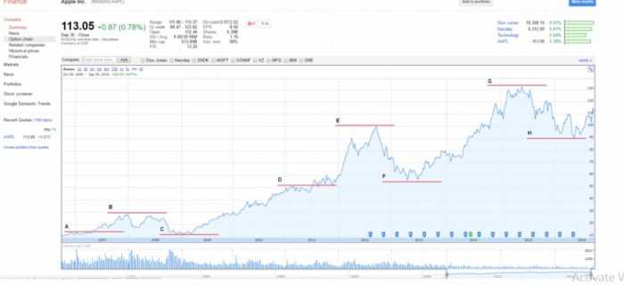
    Stock charts will provide you the information about the stock’s past trading prices and volumes. This is a remarkable advantage when it comes to technical analysis.

    By Guy Avtalyon

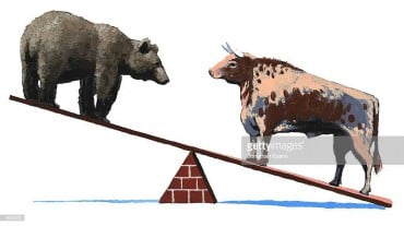
    How to read stock charts and what they are trying to tell you? How can you use them in making your investment decisions? So let’s see the importance of price action and technical analysis. Because that’s it.

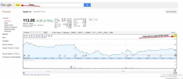
    We are 100% sure you’ve already had the opportunity to see the stock charts, for example, Yahoo Finance is one of those places. If you want to get some experience with outlook and parameters, it is the right place. Also, you could see the stock charts when you examine the company’s stock you wanted to buy.

    And what can you see? 

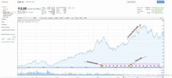
    There are two types of charts: line and candlestick. It looks so simple and a small graph but contains a lot of very important data. For example, you can see the opening and closing price, the lowest and the highest price of the stock, and plenty of other information set in that small image.

    What trading charts can tell?

    You must know, a chart is a visual illustration of changes in stock price and trading volume. They are not magical or scary. In essence, the charts do one easy job: They want to tell you a story about the stock. Stock charts will give you an objective picture without hypes and rumors. They will neglect even news and tell you the truth and what is really going on with your stock. 

    For example, when you learn how to read stock charts you’ll be able to notice if institutional investors are heavily selling. That will quickly provide you valuable info on what you have to do. The charts literally tell you that. If you see in the graph the investors are massively buying, what are you going to do? What do the charts want to tell you? They want to tell you: buy too. Or if you see they are selling: sell too. Those investors are heading the exits.

    The institutional investors’  buying or selling will shift your stock up or down. And the charts will tell you that on time. So you’ll be ready for action. That is extremely important in the stock markets that are volatile and stock price can change in a second.

    How to read stock charts

    Reading charts is one of the most important investing skills. Stock charts will tell you if the stock is depreciating or appreciating because they are recording the stock price and volume history. Well, when you grow your skill in chart reading, you’ll be able to find more. You will notice some small, often indirect signs in the stock actions such as whether the particular stock showed some unusual activities. 

    You choose the type of chart that best suits you, a line chart or a candlestick. But the charts will show you the price of daily changes in its price area. 

    Let’s breakdown all these bars and lines

    You will notice the vertical bars. They record the share price span for the chosen period. The horizontal dash that intersects within the price bar shows the current price. Also, it shows where a stock closed at the end of the day. If the color of the price bar is blue that means the stock closed up but if it is red the stock closed down.

    In the volume area, below the horizontal line, you will also see bars but volume bars that represent the number of shares traded in some period, day, week, month, etc. The color of the bars tells us the same as price bars. Also, there you will see the average volume for some stock over the last 50 days.

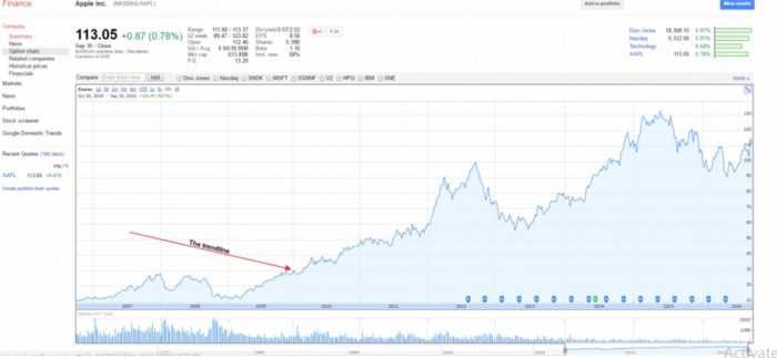
    Charts will tell you all about the average share price over the last 50 days and the last 200 days of trading. But by reading stock charts you will have the info about how the stock price moved compared to the market. It is a so-called relative strength line. When this line is trending up, we can say the particular stock is outperforming the market, the opposite means the stock is lagging the market.

    Changing the time period

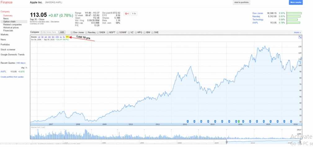
    You can do that and have a look at the daily, weekly, monthly charts. 

    Daily stock charts will help you to measure the current strength or weakness of a stock. These charts are very useful for identifying the precise buy points and creating a short-term trading strategy.

    Weekly stock charts will help you to recognize longer-term trends and patterns in stock prices. The weekly charts use logarithmic price scaling. So, you can easily make comparisons between stocks or the major market indexes.

    Indicators in the stock charts

    All the charts will come with them. Indicators are tools that provide visual representations of mathematical calculations on price and volume. Well, they will tell you where it is possible for the price to go further. The major types of indicators are a trend, volume, momentum, and volatility. Trend indicators show the direction of the market moving. They are also known as oscillators because they are moving like a wave from low value up to the high and back to low and high again as the market is changing.

    Volume indicators will show you how volume is developing over time, how many stocks are being bought and sold over time. 

    Momentum indicators show strong the trend is. They can also reveal if a reversal will happen. They are useful for picking out price tops and bottoms. 

    Volatility indicators reveal how much the price is changing in a particular period. So, volatility isn’t a dangerous part of the markets, you have to know that. Without it, traders would never be able to make money! In other words, how is it possible to make a profit if the price never changes? High volatility means the stock price is changing very fast. Low volatility symbolizes small price moves.

    Some traders don’t use indicators because they think the indicators can smudge the clear message that the market is telling. Well, that’s obviously an individual approach.

    What are Support and Resistance Levels

    Stock charts will help you to identify support and resistance levels for stocks. Support levels are price levels where you can see increased buying as support to stock’s price that will direct it back to the upside. Resistance levels, as the opposite, shows prices at which a stock has presented a trend to fall while trying to move higher, and switched to the downside.

    Recognizing support and resistance levels is extremely important in stock trading. The point is to buy a stock at a support level and sell it at a resistance level. That’s how you can make money. If some stock has clear support and resistance levels, the breakout beyond them is an indicator of future stock price movement.

    For example, you have in front of you the chart and you notice that the stock didn’t succeed to break above, let’s say $100 per share. And suddenly, it makes it. Well, in such a case you have a sign that the stock price will go up. You might see, as an example, that some stock traded in a tight range for a long time but once when it broke the support level, it will continue to fall until a new support level is established.  

    Bottom line

    Knowing how to read stock charts will give you a powerful tool while trading. But you have to know that charts are not perfect tools. Even for the most experienced analysts. If they are, every stock trader and investor would be a billionaire.

    Nevertheless, knowing how to read stock charts will surely help you. That may increase your chances of trading stocks. But you will need a lot of practice. The good news is that everyone who spends time and gives an effort to learn how to read stock charts can become a good chart analyst. Moreover, good enough to enhance the success in stock market trading. 

    Try to learn this. It can be valuable. We’re doing smart trading.

  • How To Read A Stock Charts With Examples?

    How To Read A Stock Charts With Examples?

    How To Read A Stock Charts? 7
    Amateur traders act upon impulses and this is a problem because all is not as it seems in the market.

    By Guy Avtalyon

    Stock charts are extremely important. When you enter the stock market, which means that you bought your first stock, you will find that you have to follow the movement on the stock market through stock charts.

    First of all, you have to register that fund managers and big investors account for 80% of all trading activity in the market. Their buying and selling will either push your stock up or down. But you are the individual investor and your primary intent is to buy stocks big investors are buying ponderously and of course, you want to stay away from stocks they’re aggressively selling. That’s where charts enter. Once you know what to look for, you’ll see that charts literally show you what these big investors are doing. You’ll be able to fast realize when a stock is being ponderously bought or sold. You’ll be able to use that information to identify the best time to buy, sell, or hold your stock positions.

    There are many different types of stock charts: line, bar, candlestick, mountain, point-and-figure, and others. You can see them in different time frames: daily, weekly, monthly, and intraday charts. Even each style and time frame has its advantages and disadvantages, all of them provide you information important to make investing decisions.

    Also, there are many different types of stock charts that display various types of information. But all stock charts display price and volume. On each stock chart, the price history is visible. The bars represent the amount of trading history.
    For example, on a daily stock chart, each price bar shows the prices the stock traded during that day. On a weekly stock chart, each price bar represents the prices the stock traded over that week.

    The length of each vertical bar shows a stock’s high/low price range. The top of the bar shows the highest price that is paid for the stock per period and the bottom of the bar shows the lowest price paid. The small horizontal slash shows the current price or where a stock closed at the end of the observed period. The price bar is blue if the price of the most recent trade is equal to or greater than the previous period last price, or deep red if it is lower than the previous period’s price close.

    The vertical lines at the bottom of the chart show the number of shares traded during the observed period of the chart. The length of the volume bar shows a value that corresponds to the scale at its right. The color of a volume bar is determined by its corresponding price bar. It’s blue if the most recent trade is equal to or greater than the previous period’s last trade. And magenta if it is less than the previous closing price.
    Well, you are beginners so it is important to show you step by step how to read charts.

    You can use different websites but I think that Google Finance has a smooth user interface.

    How typical stock chart look?

    Now let’s take a look at a typical stock chart. We used Dow Jones Industrial for this guide.

    You can see, the series of letters after the name of the company is the ticker symbol. It identifies the company on the stock exchange.

    We’ll search for AAPL, which is Apple’s ticker symbol.  

    How To Read A Stock Charts? 6

    Then, click the button to expand the chart to full screen:

    How To Read A Stock Charts?
    Now let’s jump into the different pieces and parts of the stock chart so you can begin to read like a pro.

    How to identify the trend lines?

    This is that blue line you see every time you hear about a stock! It’s either going up or down right? The trend line seems like common sense, but there are a few things I want to show so you can understand it in a little more detail.

    You know that stocks will take huge dives and also make huge climbs. If you’ve read previous chapters you’ll know that you have to hold your emotions in control to be a successful investor.

    Never react to large drops or huge gains in a positive or negative way. You are using this piece of the stock chart only to see what’s going on.

    The trend line should motivate you to dig further. For instance, Apple as a company really took off from 2009 to 2012. But in the period 2012/2013, the stock began to go down more than 40%!  This is where your trend line is useful.

    Something is happening and you have to pay attention to it. You have to find out what’s going on with this company. Most strong companies can recover from hits like this, but you have to be careful.

    I have to recall some history here. Right around this time, Apple experienced a few major changes. First, it’s longtime CEO, Steve Jobs, resigned (2011). Also, around 2012, Apple informed that their profit margins were significantly decreasing, despite the growing smartphone market. They were trying to expand the smartphone into developing countries, but they were too expensive to enter there. And the stock price is falling.

    But new CEO Tim Cook made strategic moves with the company and the rest of the trend line shows that.

    How to use trend lines?

    The lesson here is how to use your trend line as a first peek, an indicator of something worth to look int

    The next thing you have to look at is the lines of resistance and support.

    These are levels at which the stock stays within, over a certain period of time. A level of support is a price that a stock is unlikely to drop below, while a level of resistance is one that it’s unlikely to go above. It will stay the same until some major change occurs, such as a reduced profit margin.

    A stock’s price does the same thing within these lines of support and resistance.

    The point here is to know when to buy and when to sell.

    Take a look at Apple’s stock chart again:

    I want to show you how the process is important. You have to know that everyone will draw lines of resistance and support differently, depending on how long they plan to hold the stock. Short-term investors can draw more to analyze trends during a shorter period.

    So, what we can see in this image?

    How to recognize the support and resistance levels? 

    Line A represents the very first line of support shown. Based on trends earlier to this, everyone feels comfy that the stock price won’t go below this point and probably consider buying at this price or higher.

    Line B is the first line of resistance. It is obvious that the stock has peaked at that point for now and it is expected to go higher. Maybe it’s time to consider selling at this price or slightly lower.

    Line C shows, the stock has bottomed out again, thus creating a new line of support.

    Line D shows the stock price has increased significantly and it’s comfortable to establish this as a new line of resistance.

    The trend continues with Lines E, F, G, and H, bringing new lines of support and resistance as time goes on. If it seems complicated, don’t worry. because it is. And a lot of these are speculations.

    The lines of resistance can help you to decide when to buy or sell. But remember, it’s subjective and it won’t give you a clear opinion of what to do. You have to use some of your own analysis and evaluation.

    How to notice in the stock charts if the company pays dividends?

    On the next chart, you can see if and when the company issued a dividend, as well as if there was ever a stock split:

    How To Read A Stock Charts? 4

    A dividend is when the board of directors decides to give a portion of its earnings back to its shareholders. If you own their stock, you get a small piece of the profit.

    Some companies issue dividends, some don’t. If a company doesn’t issue a dividend doesn’t mean it’s not worth investing in.

    Some companies just prefer to focus on growth, so they’ll reinvest their earnings as opposed to giving it back to the shareholders. Apple, in this case, could pay dividends quarterly without influence on growth.

    Also, you can see that there was a stock split in 2014. That is a strategic move made by the company’s board of directors to issue more shares of stock to the public.

    In this case, Apple did a seven to one stock split, noted as 7:1, which means that for every share of AAPL shareholders owned prior to the split, they now have seven.

    The value of the company doesn’t change, but the share price might. Companies will often do this to attract smaller investors when the share price decreases.

    Many times when a stock split happens, more people invest because the share price is often lower. That increases demand and the overall share price.

    How to find the trading volume in the stock charts?

    On the bottom of the chart, you can see many small, vertical lines. This is a trend of the volumes at which the stock is traded. Volumes shouldn’t be the only determining factor when buying a stock. Usually, trading volumes increase when the company is in public focus, in a positive or negative sense.

    When volumes are increasing, it can also shift the price of the stock quickly. Take a look.

    How To Read A Stock Charts? 5

    Line A, shows a high volume of trading activity that corresponded with a drop in the stock price. Maybe some bad news that day caused people to panic.

    Line B, you can see a slight uptick in trading volume that corresponds with an upward trend in the stock price.

    You shouldn’t necessarily have to assume it there will be a connection between stock price and trading volume. But it’s good to know what the volumes have been in the past and what they are currently.

    If the volumes are high, a lot of people are trading the stock that day and it is a good idea to buy or sell it quickly.

    This is the basics of how to read the stock charts. Once you’ve mastered most of these techniques, you should be able to analyze a stock’s historical activity with high success. 

Traders-Paradise